If you have a genuine installation of Windows 7, 8 or 8.1 you are able to upgrade to Windows 10. This is the top news of this week when Windows 10 was officially presented. The entire event can be watched here: Read More
Category: News
Recent events and notices about withsteps.com
Firefox 17 with Social API – Facebook notifications and Messenger
With the last release of Firefox, Mozilla has included its new Social API with a nice previews integration of Facebook Messenger and notifications. Read More
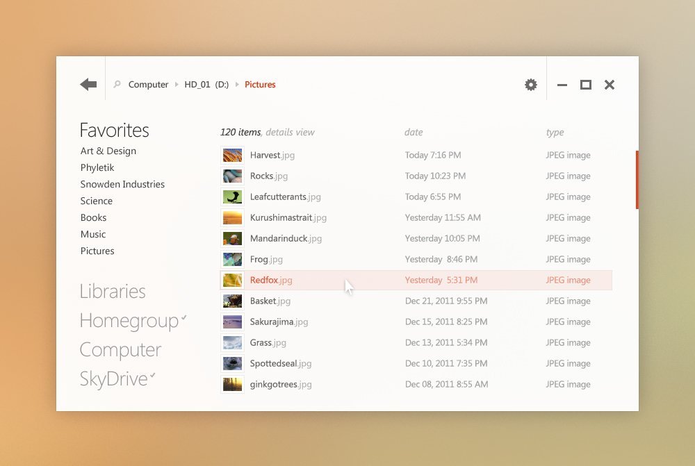
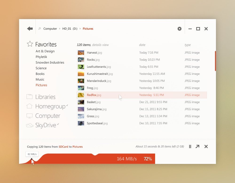
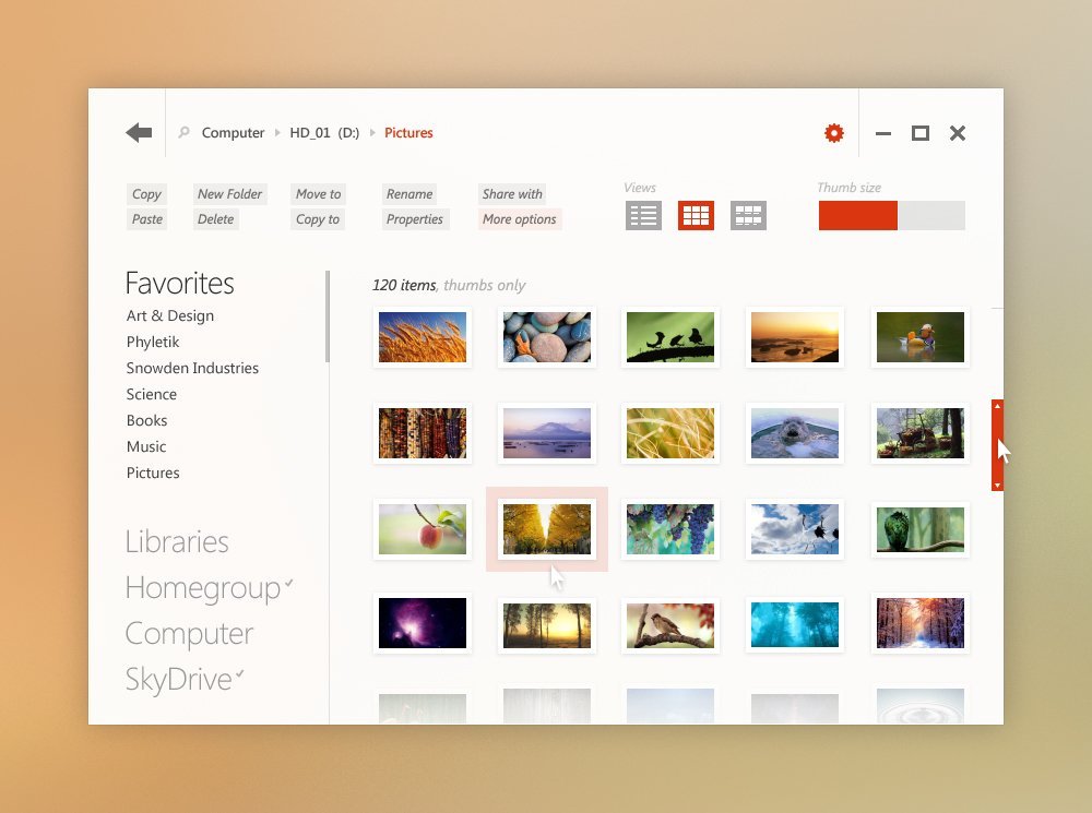
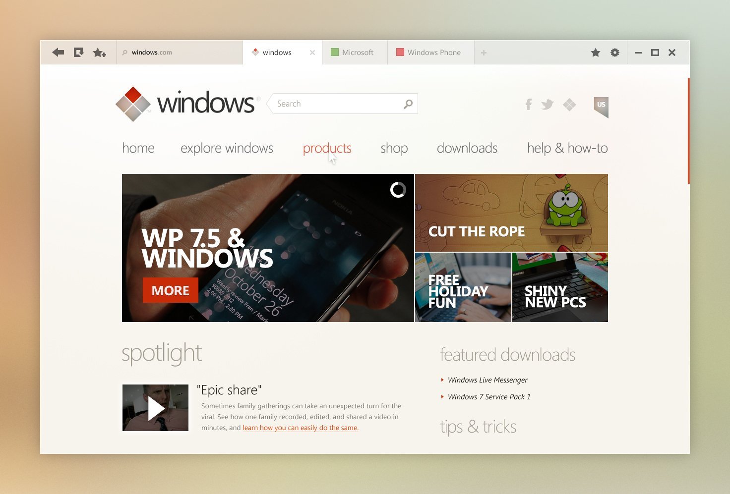
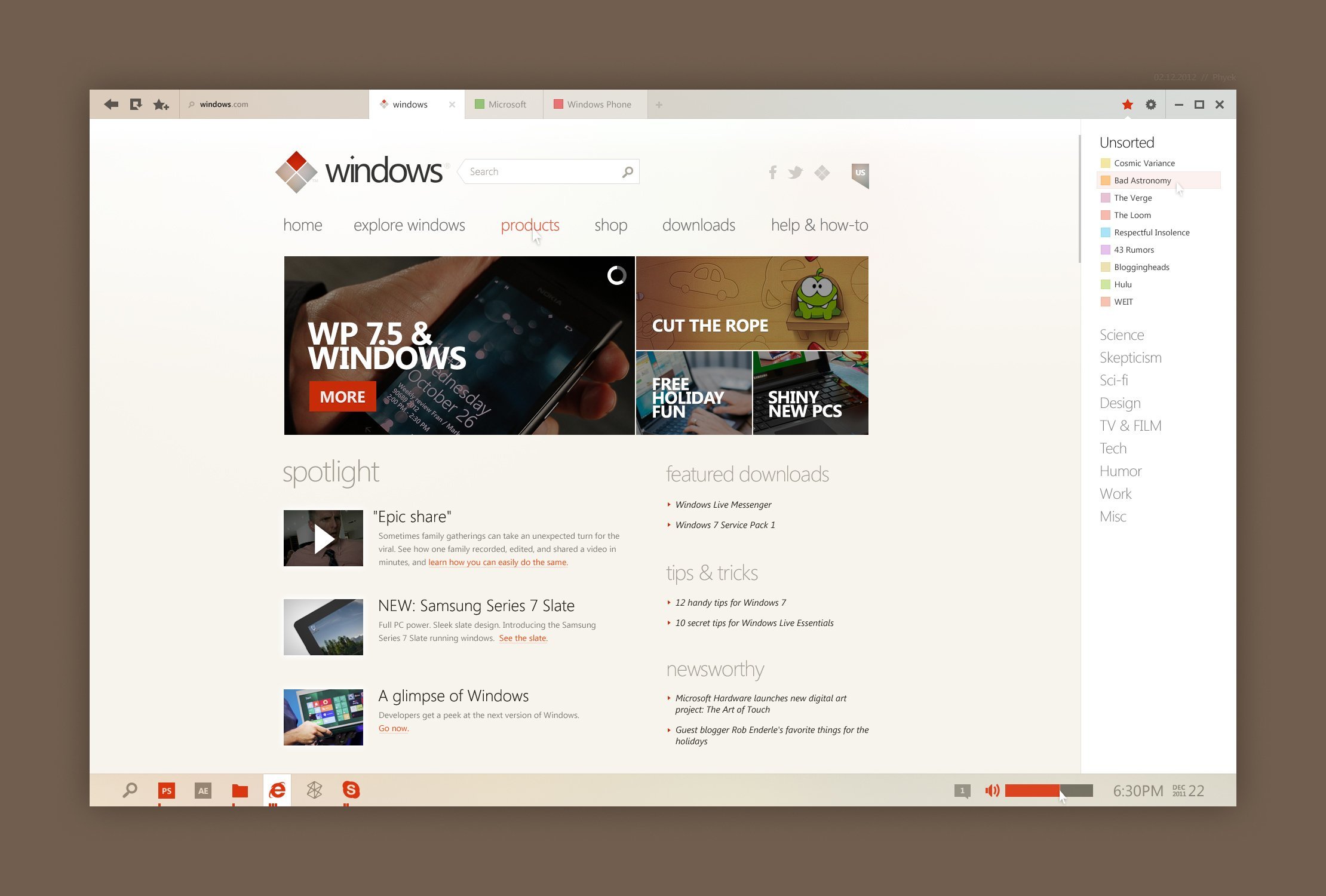
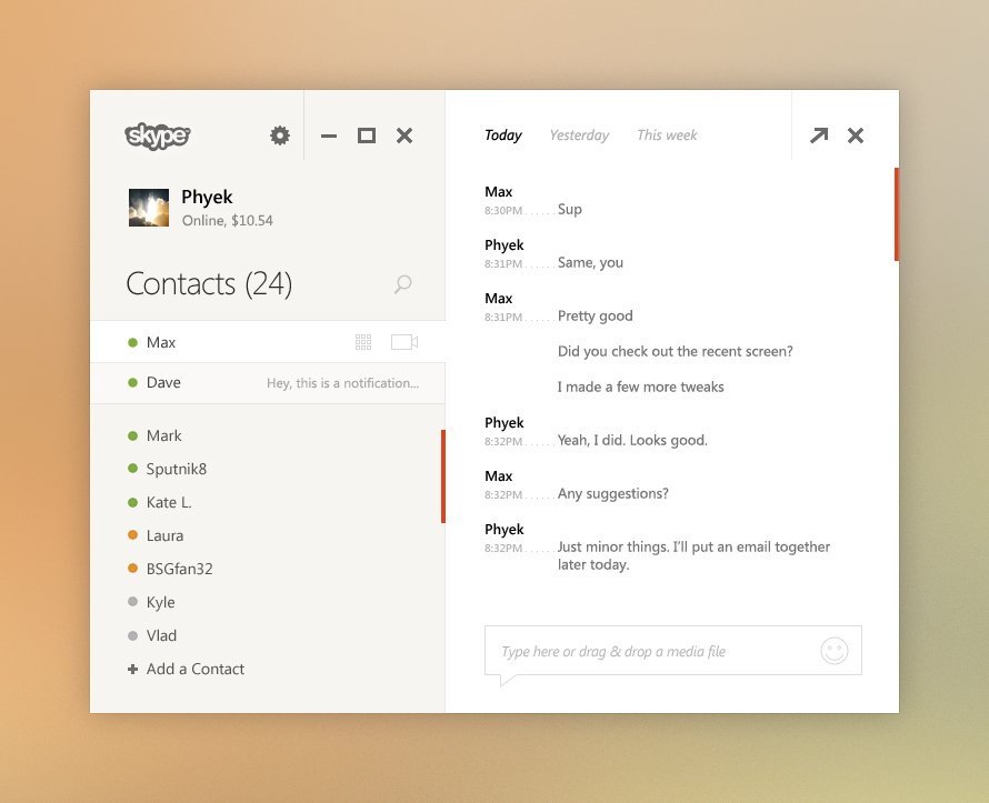
Beautiful Windows User Interface (UI) Concept
theverge.com offered these days a beautiful concept of a Windows interface. Fonts and basics design lines are clearly inspired by Windows 8 “metro” style but it also came with beautiful and creative ideas. I think that this interface can be attractive even to the biggest Apple fans.
This is a desktop concept that I’ve recently put together for fun. I thought I’d post a few screens to see what people here think. The screens include variations of explorer, ie (with a quick redesign of windows.com and bing), media center/player, and skype.
Microsoft is set to retire the Zune and Windows Live brands with Windows 8, it’s reported, as well as offer a switchable tablet/desktop UI in the Office 15 apps for increased finger-friendliness. The so-called “Touch Mode” button has been spotted in the Office 15 technical preview but is not yet functional, according to ZDNet‘s source, but which will presumably boost icon size among other tweaks for those using the software in Metro mode on tablets and touchscreen all-in-ones.
Via [slashgear.com]

