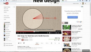
A while ago, YouTube started to test a new interface design. The new design is based on the simplicity and usability that defines all other products and services from Google. The new YouTube looks a lot more cleaner and that’s because more and more white space is used instead of a couple of old information that appeared around a video. Also, the information on top of the video is minimized and the round corners got removed.
If you are curious and want to check the new design on your account then just follow this simple steps:
1. First, select the browser you’re using: Firefox or Google Chrome
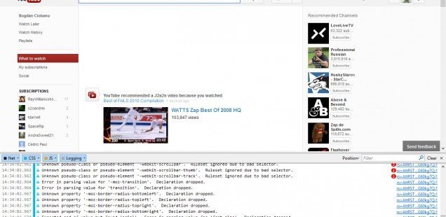
*If you are using other internet browser please install or use one of those mentioned above in order to make this operation.
Using Firefox
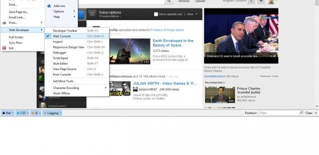
2. Open the Web Console by clicking on the Firefox Button -> Web Developer -> Web Console … or by pressing Ctrl+Shift+K
3. Type in the web console this code:
document.cookie="VISITOR_INFO1_LIVE=jZNC3DCddAk; path=/; domain=.youtube.com";window.location.reload();
4. Page should now be changed to the new layout. Go back to Firefox button and disable the Web Developer tool.
Using Google Chrome
2. Open the Developer tools by clicking on the Wrench Button -> Tools -> Developer tools and select console … or by simply pressing Ctrl+Shift+J
3. Paste the same code:
document.cookie="VISITOR_INFO1_LIVE=jZNC3DCddAk; path=/; domain=.youtube.com";window.location.reload();
4. Wait for the page to be refreshed and changed.


